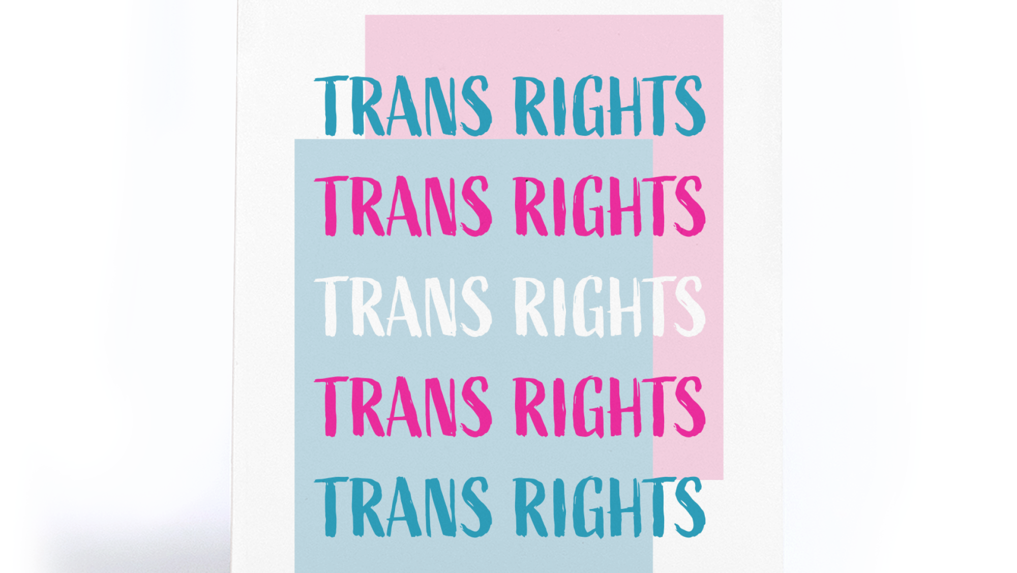
You may look at my personal brand and have questions.
Why a deer?
Why plants?
What is that typeface?
Why is your Instagram handle springartistry?
Why plants?
What is that typeface?
Why is your Instagram handle springartistry?
The stories behind all of these are personal and important, so I want them to be more than just fun anecdotes people only hear when it comes up naturally in conversation. I want to share more about myself through the lens of creating my brand and my identity as a designer.

The Whys
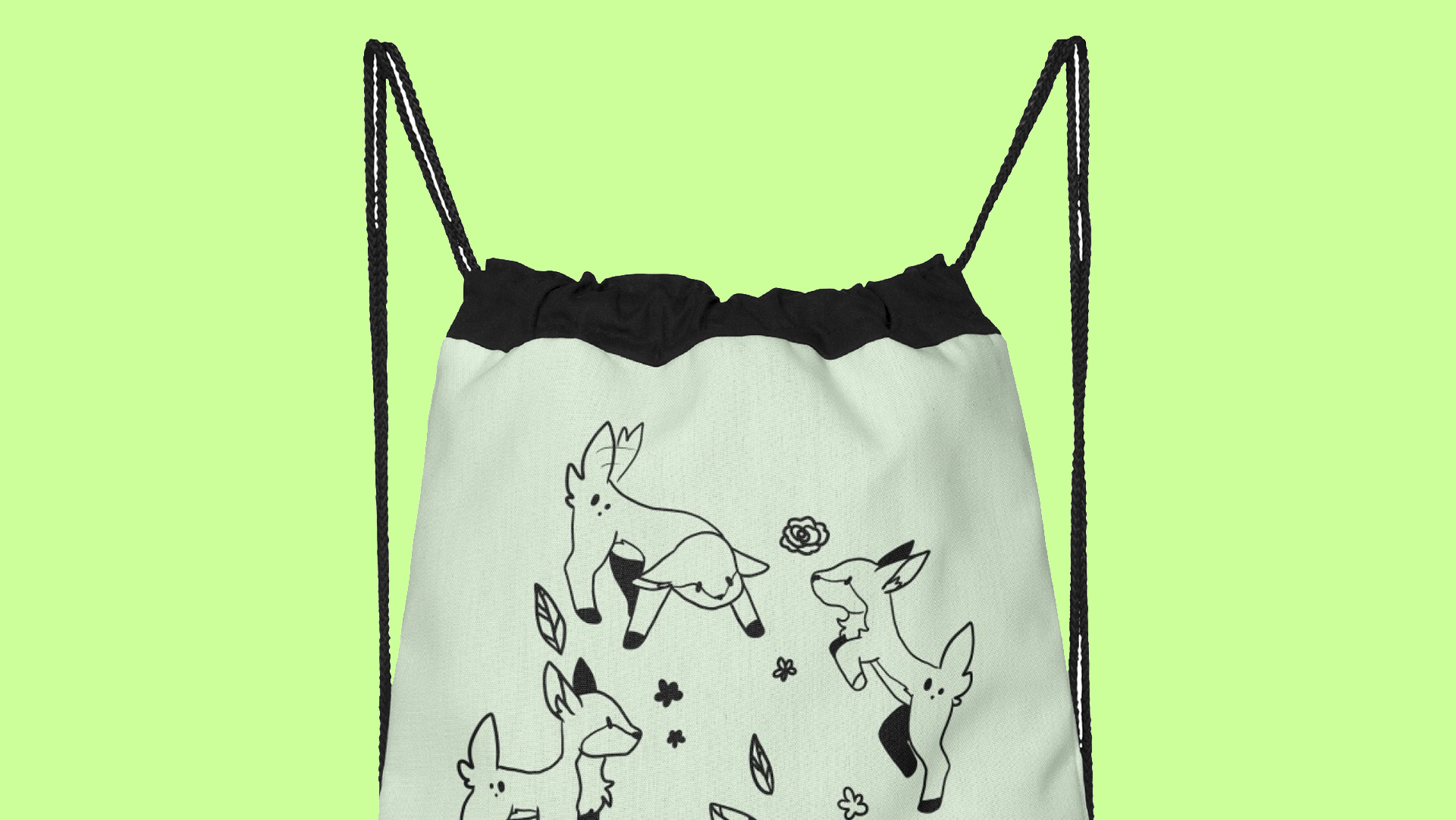
My brand identity centers around two kinds of imagery: deer and plants. Both have important meanings in my life and who I want to be seen as in the design world.
Deers are my favorite animal, they're cute and graceful but oh-so-skittish. I've been likened to a deer several times because of my shy nature and penchant for staring at anything that makes sudden movements or noises like a "deer in the headlights".
Plants, on the other hand, are a universal symbol for growth. As I enter the working world, I want to make it clear that I am in a constant state of learning and growing.
As for why many of my social media tags are some form of "SpringDesigns" or "SpringFlurry", SpringFlurry was my first ever username when I started sharing illustration work on DeviantArt circa 2017. The name has stuck with me ever since, and if I'd never started showing my art, then I don't know if I'd be here now!

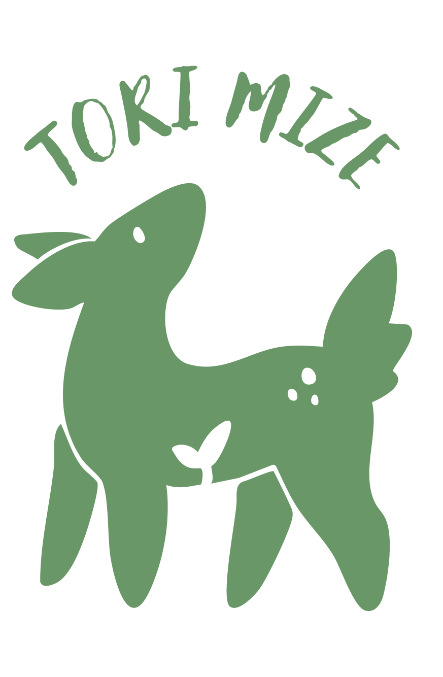
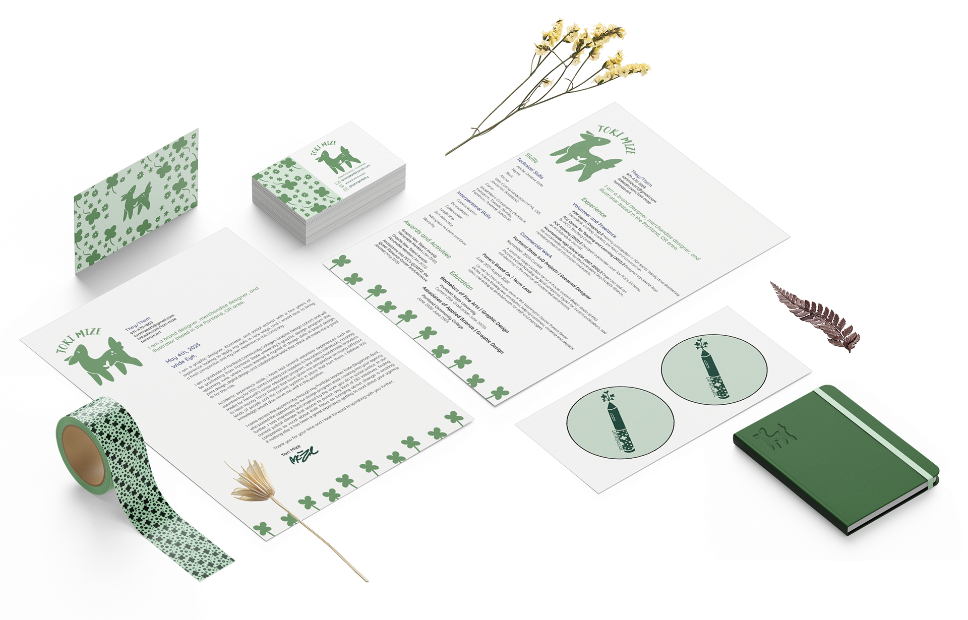
The Logo
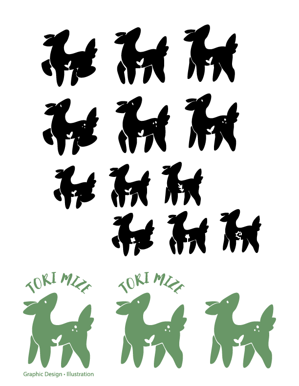
The Logo combines my beloved deer with a small plant growing into the silhouette. The focus of my exploration was to figure out what kind of plant, as well as what pose the deer should be in.
After several rounds of exploration, I landed on this standing position with a sprout inside the silhouette and the addition of eyes and spots to create a cutesy look. The final lockups include an icon version, an icon + name version, and a full version with a name + a subtitle.

The Brand Identity
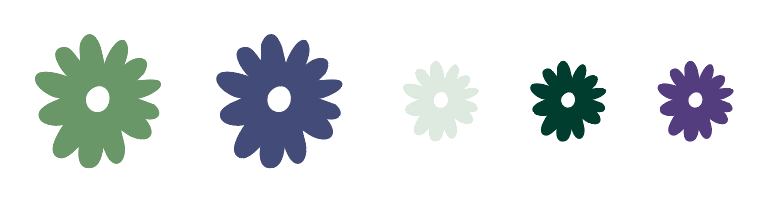
The colors take cool springtime greens and pair them with deep purples to create a soft, jewel-toned brand aesthetic.
The two primary colors (the medium green and indigo, shown in the larger spots) are for major brand images. The mint is used for background, the dark green is used for text and dark images, and the brighter purple is for minor accents.
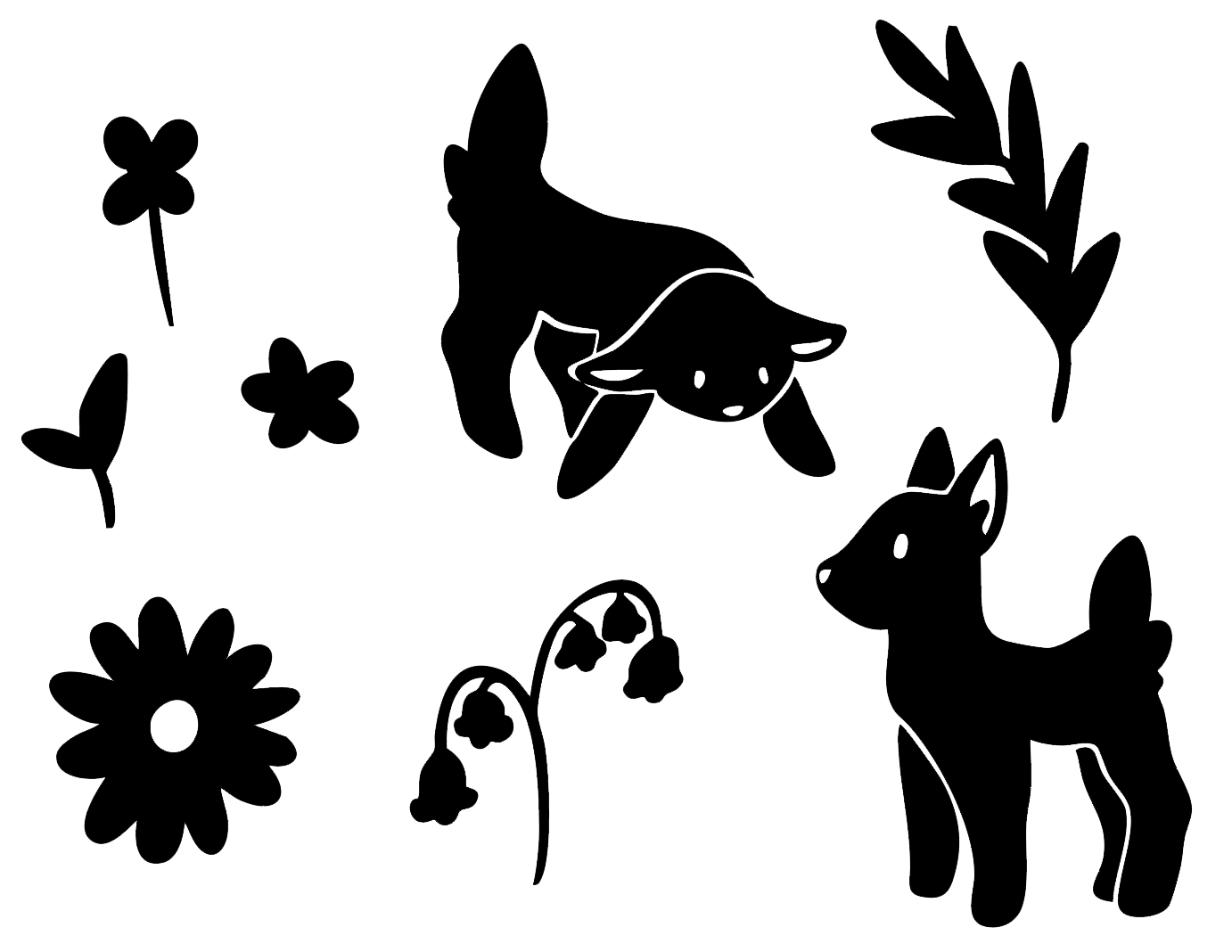
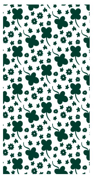
The brand assets include both splash illustrations and a base pattern for use in my branded material.
The splash illustrations take a bunch of flowers and simplifies them down into vector shapes. The floral pattern draws from many of the plant illustrations I've made, piecing them together like a puzzle, and is used as my banner across all of my social media accounts.
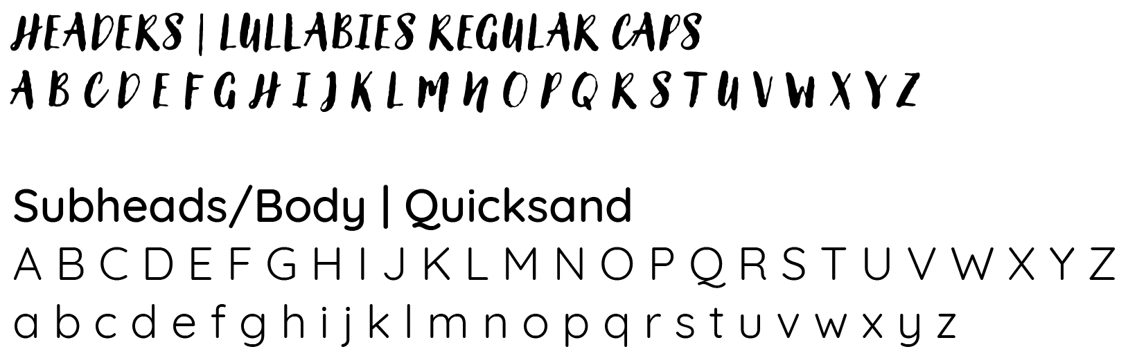
The typography uses organic shapes and rounded edges.
Headers use Lullabies Regular in all caps with 30% tracking to increase readability. This font has a handwritten, felt-pen feel that I adore.
Subheads and body copy use Quicksand in either Regular, Medium, or Bold depending on need. Rounded and readable with some flair on certain letters, Quicksand fits perfectly with the soft branding I've developed for myself.